Cumulative Flow Diagram
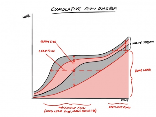
The Cumulative Flow Diagram is a simple stacked chart that shows the amount of work in the various states in the value stream and also how much has been done over time.
The vertical measurement indicates the respective queue size and how many items are in each value stream state. The horizontal measurement indicates the Lead Time taken to progress an item from the start of the value stream to done.
How It Can Be Used
The chart can be used to show short or long term trends in the flow of the work with inefficient flow with long lead times and large queue sizes, compared with efficient flow that has comparatively shorter lead times and smaller queue sizes.
The impacts of flow can be seen on the chart with large batches of work represented as large queue sizes that can be seen moving from one part of the value stream to another.
Who It Is For
This chart is mainly for the team to understand the impact of flow in their team and can be used with the Kanban Framework for example to adjust the Work In Progress (WIP) Limits.
How It Can Be Misused
The charts tend to work best to represent longer term trends rather than short term impacts and so can be misused by referring to them too often as an indicator of scope changes or performance for example, where the intention is about understanding the flow of the work.
