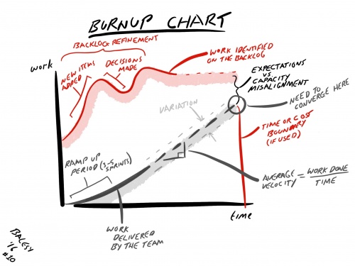
Burnup Chart
The mechanics of the Release Burnup chart are also quite simple, as there are two tracks, firstly the amount of work on the Product Backlog for the release, and secondly the amount of work completed by the Development Team per Sprint.
This shows the variation of the work on the Product Backlog that can be compared to the relative progress of the team on a Sprint-by-Sprint basis.
If the Product Backlog is adjusted as part of the Product Backlog Refinement, then this change in the amount of work can be reflected on the chart and show when the amount of work increases due to new items added, or decreases when items are removed or refined.
Ideally, the two tracks of how much work on the Product Backlog and the amount of work completed by the team should meet and intersect when all of the work has been done.
If a fixed cost or fixed time constraint is used within a project for example, then this can be represented as a vertical line on the time axis. Hence, for a successful project, the two tracks have to intersect before or on the vertical line of the time constraint.
When compared to the Velocity chart, there may well be quite a bit of variation in the team’s Velocity. However, when this is represented as a cumulative completion of the work against that on the Product Backlog, it is not unusual to have a nearly straight line that can be a trend indicator of the capacity of the teams. This is due to the scale of the two charts, where the Velocity chart may be done with a scale of 10s of story points for example, but the Release Burnup chart may be done with a scale of 100s of story points. Hence, the sensitivity of the Velocity chart is reduced in the Release Burnup chart.
How It Can Be Used
The Release Burnup chart is great to communicate to stakeholders about the growth or contraction of the work on the Product Backlog with respect to the amount of work completed by the team. This really helps to refine their expectations to align with the team’s capacity to deliver as well as providing a consequence to adding more and more great ideas to the Product Backlog.
Where there is an obvious discrepancy between the two tracks, this indicates how much work has to be removed from the Product Backlog in order to have a successful outcome. Using this information with the Product Owners and stakeholders can aid the Product Backlog Refinement activities to edit back to something more aligned to the capacity of the team.
When teams first start off, their Velocity may not be representative of their capacity, as they are orientating themselves to the problem, the possible solution and how they work within this context. Hence, it is usually a good idea to collect data for at least three initial Sprints first before forecasting ahead. This will provide a bit of ramp up time for the team to get into their groove and provide a more realistic forecast.
Who It Is For
This chart is really for everyone, as the team understand how they are doing compared to the bigger picture, Product Owners understand the impacts of their Product Backlog Refinement activities and Stakeholders understand how much they have to edit their expectations with respect to the team’s capacity.
How It Can Be Misused
The forecast of the team’s completion of the work should be done based upon the moving average Velocity of the team to provide a more accurate prediction based upon the exhibited evidence so far. If the prediction is done using arbitrary figures, for example, as a quota then this may set unrealistic and hypothetical expectations and prevent the Product Owner and the stakeholders from refining their expectations until it is too late, when the options for corrective action are more limited.
It is much easier to work with actual average Velocity figures early on when there are more options available for the Product Owner and the stakeholders to modify their understanding of what is the best possible product within the constraints and capacity of the team.
