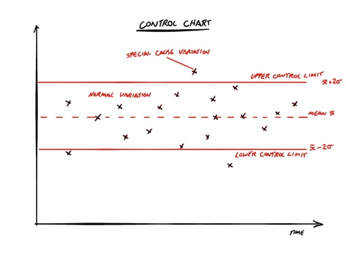
Control Chart
The Control Chart was first introduced by Walter A. Schewhart in the 1920s and then popularised by Edwards Demming suring the 1950s and 60s to provide a statistical chart that represents the different between natural and special cause variation. It was argued that all systems exhibit a natural variation and are never 100% accurate, however, outlier readings may indicate a special cause variation attributed to some particular event that caused the system to exhibit unnatural behaviour.
The Control Chart has been closely aligned to Lean and flow based work when using Kanban for example and can be used to represent fluctuations in Cycle Time or throughput rates for example.
Structure
The general structure is to draw a line for the mean of the sample of reading and then to create upper and lower control limits which are 3 standard deviations or 3σ above and below the mean respectively.
In addition upper and lower warning lines can also be drawn at 2σ above and below the mean.
The intention is to represent 99.7% of the a normal distribution of data that lies within the control limits and fluctuations within the limits are expected to be due to normal variation, and data points outside of the control limits indicate special cause variation due to external events.
Variations
Some users of Control Charts may use 3 standard errors above and below the mean for the upper and lower control limits.
In addition, some control charts plot a rolling mean and standard deviation to indicate trends in the data such as the results of positive process improvements for example.
How It Can Be Used
The chart can be used to show variations in throughput or Cycle Time when working with the Kanban framework for example, illustrating when blockers or other external events impact the throughput.
Similarly, increases in throughput could be viewed as a positive indicator of process improvements for example.
Who It Is For
The chart is predominantly for the Development Team to provide a representation of the data so that they can make informed choices about process improvements etc.
How It Can Be Misused
The chart can be misused if it is used as a performance indicator of the team. If there is little or no understanding of normal variation in the system, then the chart can also be misused by driving the team towards an unobtainable stability that does not tolerate any fluctuations in the data.
