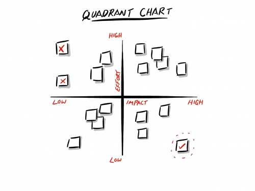
Quadrant Chart
Jump to navigation
Jump to search
A quadrant chart is similar to a Decisional Balance sheet in that two axes are normally drawn up in a chart to indicate 2 qualities or categorisations.
Post-it notes or similar are then placed on the chart corresponding to the two axes, usually as a facilitated team discussion activity.
Some examples of these include:
- Plotting risks and issues with respect to impact and effort to fix axes to indicate which items have the most impact but can be fixed quickly
- Plotting features with respect to effort and revenue axes to indicate which items are yield the most return on investment
- Plotting possible features with respect to desire and effort to indicate which possible exciters can be included in the next release
Finish up with a brief discussion to derive some conclusions from the information.
